
The Euro
Every journalist loves a scoop, and my best one to date made me briefly almost famous. It was a while ago, but I still get asked about it – so here’s the full unexpurgated story.
Sorry it’s so long. I didn’t have time to write it short.
In early 1997 the banknote designs for the new European currency, the euro, were revealed. This was quite a big deal for the European Monetary Institute (now the European Central Bank) in its grand project to create a new super-currency. The banknotes were created by Robert Kalina, an Austrian designer who had won a prestigious international competition.
Kalina chose to use architectural elements as the (ahem) keystone of his designs: windows and doors on the front (obverse), bridges on the back (reverse). Each of the seven denominations would feature elements typical of one of the ‘seven ages of cultural development’ in Europe, from the ancient to the modern. The designs were heavy with visual metaphor: the doorways, windows, and bridges were said to be symbolic of the new connections being formed by the peoples of Europe.
 One of my main jobs at that time was editing a magazine about the design and engineering of bridges, called Bridge Design and Engineering. It might sound incredibly dull, but in fact it was a beautiful coffee-table quarterly which managed to convey complex technical information alongside stunning photography and graphics. Naturally, I took an interest in the banknote designs and had copies of the artwork sent over at the first opportunity.
The accompanying press release was explicit about the provenance of the edifices depicted. These were not based on any real structures, it said, but were entirely made-up designs which were merely typical of those seven ages of culture. The political sensitivities within Europe meant that no real bridge could be shown, for fear that this would seem to favour one nation over another.
Nevertheless, I noticed a remarkable similarity between the bridge shown on the 500 euro note and a structure I had visited and written about not long before. The Pont de Normandie was still under construction near Le Havre in northern France, and was set to become the longest cable-stayed span in the world. To a casual observer it might have looked like any number of modern structures, but to a nerd like me the design details gave it away.
I’d met the designer of the bridge, Michel Virlogeux, a couple of times at international conferences and had struck up a friendly relationship with him. I fished out his business card, dialled his number, and asked him if he knew anything about the banknotes. He didn’t, but was intrigued, so I faxed Kalina’s design over to him – fax being the main form of electronic communication back then.
 Within about ten minutes my phone rang, and a rather animated Virlogeux told me that this was categorically the Pont de Normandie. He noted the same details I had pointed out – in particular the so-called ‘missing pillar’ – and said he would be prepared to stand up in court and claim the design as his.
It was clear to me at this point that this could be a major story, and I set about trying to identify the bridges on the other six banknotes. My library of structural engineering books, perhaps a hundred volumes, kept me busy for a day or two and yielded a couple of new candidates. The bigger problem was with the older structures, which would be more likely to appear in history books than engineering texts – so I set up camp first in the city library, and then in WH Smith, and worked my way through the history and travel sections.
This may seem rather quaint, but remember that in the mid- to late-1990s the internet was a very much poorer place than it is today. The world wide web was in its infancy, Google was not invented, and old-fashioned journalistic spadework like this was the way facts were uncovered.
Meanwhile I had made some enquiries directly with the European Monetary Institute. I asked them if they would now reveal the true identities of the bridges, as it was clear that these were not as fictitious as had been claimed. They tried to stonewall me with a blank refusal to admit that the designs could in any way be linked to actual physical structures. After a bit of to-and-fro, in which I eventually showed them the evidence for the Normandie bridge being the same as that on the 500 euro, they crumbled. The notes were to be redesigned, they said in a letter to me, and the initial graphics were now merely ‘draft’ designs. Strangely, the word ‘draft’ never appeared in any of the publicity material surrounding the launch just a couple of weeks earlier.
They thought I’d caught them out on one design, but by now I’d identified five of the seven bridges. One was the very famous Rialto Bridge in Venice, stripped of its parade of shops and showing masonry detailing that would not be apparent to the naked eye. One was the Pont Neuilly in Paris, the image lifted directly from an old lithograph and even reproducing details of boats below and horse-drawn carriages above. It seemed that Robert Kalina had barely even tried to disguise the source of the image.
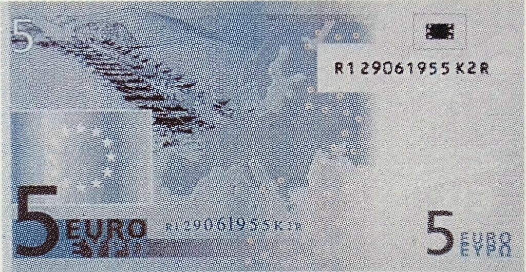
The bridge that really made headlines around the world, though, was a pontoon bridge shown on the 5 euro. This was from an 18th century engraving held in the library of the Institution of Civil Engineers and reproduced in the book Bridges – three thousand years of defying nature by David Brown. The image is of an ancient bridge in India.
In all this time, my calls to the designer had gone unanswered. I got through to Robert Kalina’s office in Vienna, but was told he was on holiday. I tried to explain that he really would prefer it if he knew about this story, but his staff wouldn’t contact him or give me any way of doing so. So the first the poor fellow knew about it was when the story broke in the world media a couple of days later. I do have a little sympathy for him, for what was probably a ruined holiday. But only a little.
The next step was to get the story out. I had just enough time to write it up for the next issue of the magazine, and cobbled together a short press release. Rather than sending it out blindly, I offered the exclusive to BBC television’s Newsnight programme. They quickly took me up on it.
A car was sent to pick me up from my Nottingham office and deliver me to Television Centre, where I arrived mid-afternoon. The plan was to stage some cutaway shots of me pretending to be in my office, on the phone, checking page proofs, and so on, and then to do a run-through or rehearsal on the Newsnight set.
For whatever reason, the rehearsal never happened. The story was scheduled to be the last on the night’s programme, and would be done live in the studio with Jeremy Paxman. I now understand exactly what people mean when they complain of ‘dry mouth’ in broadcasting.

To my relief, the segment seemed to go quite well. Joshua Rosenburg joined the discussion, being an expert on numismatics, and the BBC production team gave the story the full treatment. I remember being particularly awed by the use of the soundtrack from Mission Impossible for the pre-filmed parts, reflecting the hubristic claim from the chairman of the European Monetary Institute that it would be ‘impossible’ to identify the bridges.
The only newspaper to pick up the story the next day, from the press release sent out before the broadcast, was the faithfully eurosceptic Daily Mail. But for the next few days my phone hardly stopped as the rest of the nationals – as well as papers from around the world – sought me out. It made the front page of the Wall St Journal among others, and was reported in Brazil, Finland, and Singapore. A Frankfurt TV station sent a crew to interview me in my real office for the current affairs programme SudDeutsche Zeitung and I made a few appearances on local TV and radio stations. The London Evening Standard gave me almost a full spread.
A remarkable number of papers ran with headlines that were a version of “A bridge too far”, referring specifically to the Indian pontoon bridge and the fact that India isn’t actually in Europe.
After a few days, the fuss died down. Within a few months Robert Kalina produced some new designs, based closely on the original ‘drafts’, and the euro banknotes came into general circulation about four years later at the beginning of 2002. Today the focus of attention is on the relative weakness of the European currency and the fiscal irresponsibility of some of the minor Eurozone countries rather than the design… but the notes still show bridges and I can still identify a couple of them.
A wonderful story. I’ve been looking for an image of the 5 Euro Indian pontoon note and it seems to have been expunged from history (or at least the Internet). It would be great if you could post the designs from the press pack.
Thanks Christopher – I have added a copy of the original design for the 5 euro to the bottom of the page. Quality isn’t great but then the original in the press pack was tiny. Hope this helps!